在网页设计中按钮一般默认的都比较“丑”,能不能通过一些好的样式来设计呢,下面学无忧提供几款不错的按钮样式,希望对大家有所帮助。
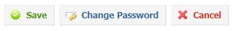
一、带图标的按钮
·按钮样式截图
·按钮样式代码如下:
/* CSS Document */
/* BUTTONS */
.buttons a, .buttons button{ display:block; float:left; margin:0 7px 0 0; background-color:#f5f5f5; border:1px solid #dedede; border-top:1px solid #eee; border-left:1px solid #eee;
font-family:"Lucida Grande", Tahoma, Arial, Verdana, sans-serif; font-size:12px; line-height:130%; text-decoration:none; font-weight:bold; color:#565656; cursor:pointer; padding:5px 10px 6px 7px; /* Links */ } .buttons button{ width:auto; overflow:visible; padding:4px 10px 3px 7px; /* IE6 */ } .buttons button[type]{ padding:5px 10px 5px 7px; /* Firefox */ line-height:17px; /* Safari */ } *:first-child+html button[type]{ padding:4px 10px 3px 7px; /* IE7 */ } .buttons button img, .buttons a img{ margin:0 3px -3px 0 !important; padding:0; border:none; width:16px; height:16px; }
/* STANDARD */
button:hover, .buttons a:hover{ background-color:#dff4ff; border:1px solid #c2e1ef; color:#336699; } .buttons a:active{ background-color:#6299c5; border:1px solid #6299c5; color:#fff; }
/* POSITIVE */
button.positive, .buttons a.positive{ color:#529214; } .buttons a.positive:hover, button.positive:hover{ background-color:#E6EFC2;
border:1px solid #C6D880; color:#529214; } .buttons a.positive:active{ background-color:#529214; border:1px solid #529214; color:#fff; }
/* NEGATIVE */
.buttons a.negative, button.negative{ color:#d12f19; } .buttons a.negative:hover, button.negative:hover{ background:#fbe3e4; border:1px solid #fbc2c4; color:#d12f19; } .buttons a.negative:active{ background-color:#d12f19; border:1px solid #d12f19; color:#fff; }
/* REGULAR */
button.regular, .buttons a.regular{ color:#336699; } .buttons a.regular:hover, button.regular:hover{
background-color:#dff4ff; border:1px solid #c2e1ef; color:#336699; } .buttons a.regular:active{ background-color:#6299c5; border:1px solid #6299c5; color:#fff; }
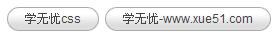
二、圆角按钮样式
·按钮样式图片
·样式代码如下:
<!DOCTYPE HTML PUBLIC "-//W3C//DTD HTML 4.01 Transitional//EN" "//www.w3.org/TR/html4/loose.dtd">
<html>
<head>
<title>Untitled Document</title>
<meta http-equiv="Content-Type" content="text/html; charset=gb2312">
<link rel="stylesheet" type="text/css" href="" />
<style type="text/css">
<!--
.clear { /* generic container (i.e. div) for floating buttons */
overflow: hidden;
width: 100%;
}
a.button {
background: transparent url("bg_button_a.gif') no-repeat scroll top right;
color: #444;
display: block;
float: left;
font: normal 12px arial, sans-serif;
height: 24px;
margin-right: 6px;
padding-right: 18px; /* sliding doors padding */
text-decoration: none;
}
a.button span {
background: transparent url('bg_button_span.gif') no-repeat;
display: block;
line-height: 14px;
padding: 5px 0 5px 18px;
}
a.button:active {
background-position: bottom right;
color: #000;
outline: none; /* hide dotted outline in Firefox */
}
a.button:active span {
background-position: bottom left;
padding: 6px 0 4px 18px; /* push text down 1px */
}
-->
</style>
</head>
<body>
<a class="button" href="//www.xue51.com/" onclick="this.blur();"><span>学无忧css</span></a>
<a class="button" href="//www.xue51.com/" onclick="this.blur();"><span>学无忧-www.xue51.com</span></a>
</body>
</html>
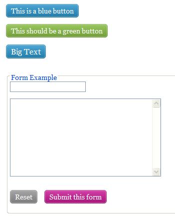
三、带导角且有背景图片的按钮样式
·按钮样式图片如下:
·按钮样式代码如下:
<!DOCTYPE HTML PUBLIC "-//W3C//DTD HTML 4.01 Transitional//EN" "//www.w3.org/TR/html4/loose.dtd">
<html>
<head>
<title>Untitled Document</title>
<meta http-equiv="Content-Type" content="text/html; charset=gb2312">
<link rel="stylesheet" type="text/css" href="" />
<script type="text/javascript" src="btn.js"></script>
<style type="text/css" media="screen">
body { padding: 20px; font-size: 0.85em; font-family: georgia, serif; }
.btn { display: block; position: relative; background: #aaa; padding: 5px; float: left; color: #fff; text-decoration: none; cursor: pointer; }
.btn * { font-style: normal; background-image: url(btn2.png); background-repeat: no-repeat; display: block; position: relative; }
.btn i { background-position: top left; position: absolute; margin-bottom: -5px; top: 0; left: 0; width: 5px; height: 5px; }
.btn span { background-position: bottom left; left: -5px; padding: 0 0 5px 10px; margin-bottom: -5px; }
.btn span i { background-position: bottom right; margin-bottom: 0; position: absolute; left: 100%; width: 10px; height: 100%; top: 0; }
.btn span span { background-position: top right; position: absolute; right: -10px; margin-left: 10px; top: -5px; height: 0; }
* html .btn span,
* html .btn i { float: left; width: auto; background-image: none; cursor: pointer; }
.btn.blue { background: #2ae; }
.btn.green { background: #9d4; }
.btn.pink { background: #e1a; }
.btn:hover { background-color: #a00; }
.btn:active { background-color: #444; }
.btn[class] { background-image: url(shade.png); background-position: bottom; }
* html .btn { border: 3px double #aaa; }
* html .btn.blue { border-color: #2ae; }
* html .btn.green { border-color: #9d4; }
* html .btn.pink { border-color: #e1a; }
* html .btn:hover { border-color: #a00; }
p { clear: both; padding-bottom: 2em; }
form { margin-top: 2em; }
form p .btn { margin-right: 1em; }
textarea { margin: 1em 0;}
</style>
</head>
<body>
<p><a href="#" class="btn blue">This is a blue button</a></p>
<p><a href="#" class="btn green">This should be a green button</a></p>
<p><big><a href="#" class="btn blue big">Big Text</a></big></p>
<form method="post" action="#">
<fieldset>
<legend>Form Example</legend>
<div><input type="text" /></div>
<div><textarea cols="40" rows="10"></textarea></div>
<p><input type="Button" id="reset_btn" value="Reset" class="btn" /> <input type="Submit" id="submit_btn" value="Submit this form" class="btn pink" /></p>
</fieldset>
</form>
</body>
</html>
四、较炫的带导角的按钮
·按钮图片如下:

·按钮样式代码如下:
<!DOCTYPE html PUBLIC "-//W3C//DTD XHTML 1.0 Transitional//EN" "//www.w3.org/TR/xhtml1/DTD/xhtml1-transitional.dtd">
<html xmlns="//www.w3.org/1999/xhtml">
<head>
<meta http-equiv="Content-Type" content="text/html; charset=iso-8859-1" />
<title>Image Rollover with CSS</title>
<style type="text/css" media="screen">
a.button { background:url(rss-feed-img.png) repeat 0px 0px; width: 123px; height: 44px; display: block; }
a.button span { display: none; }
a.button:hover { background: url(rss-feed-img.png) repeat 0px -44px; }
</style>
</head>
<body>
<a href="#" class="button">
<span>RSS Feeds</span>
</a>
</body>
</html>
以上就是几款不错的按钮样式,你是不是觉得不错呢。